SLDS Styling Hooks are CSS custom properties that let you style Lightning Web Components in a way Salesforce supports, so your design keeps working after each release. Together with SLDS utility classes and scoped component CSS, they give you a native look without hacks. They also help your components follow themes, such as the newer SLDS 2 look.
In this post, you will learn SLDS utility classes, how component CSS is scoped, the :host selector, global and component styling hooks, and what SLDS 2 supports today. It builds on LWC navigation, toasts and modals, LWC data binding and Lightning Web Components basics.
What are SLDS Styling Hooks?
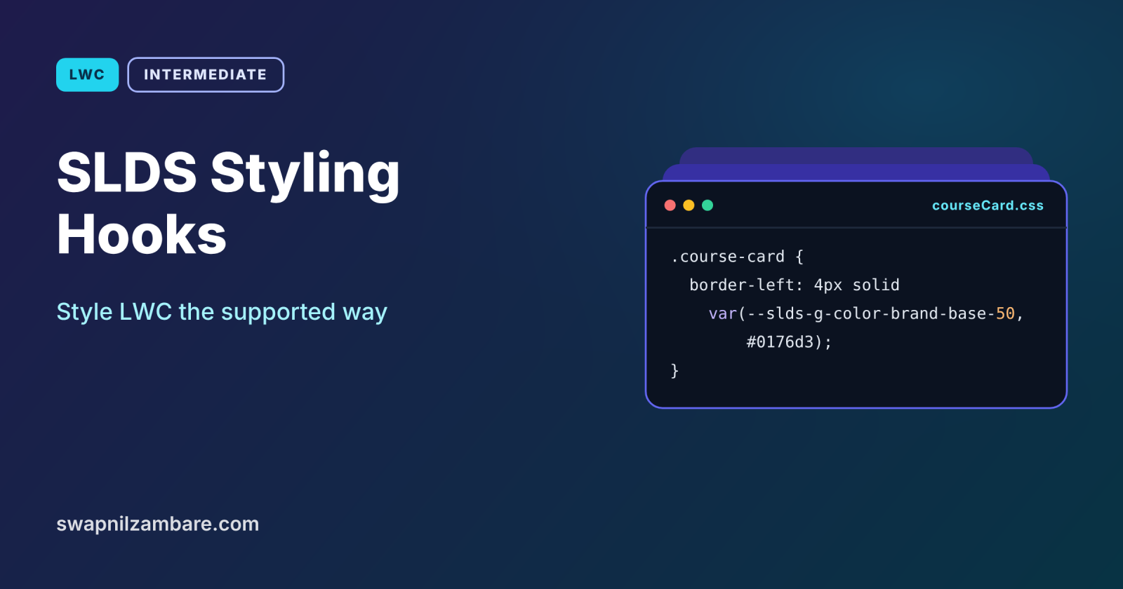
SLDS Styling Hooks are named CSS custom properties, such as –slds-g-color-brand-base-50, that the Salesforce Lightning Design System (SLDS) defines. Global hooks, which start with –slds-g, hold shared values like colours. Component hooks, which start with –slds-c, let you adjust specific base components, such as a button’s background. You read hooks with var() in your component’s CSS.
Think of a house painted with a company’s paint chart. Instead of mixing your own colours, you pick “Brand Blue 50” from the chart. If the company updates that shade, every wall using the chart updates too. Styling hooks are that paint chart for Salesforce pages.
Why SLDS Styling Hooks Matter
Custom CSS that fights Salesforce breaks easily. Here is why SLDS Styling Hooks matter at Bright Path Tutors.
- First, course cards should match the org’s theme colours.
- Also, an “Online” badge needs success colours that stay readable.
- Next, overriding base component internals breaks after releases.
- Hooks adapt when Salesforce or admins change themes.
- Finally, consistent styling makes custom pages look like standard ones.
So hooks let you style confidently without fragile hacks.
How SLDS Styling Hooks Work
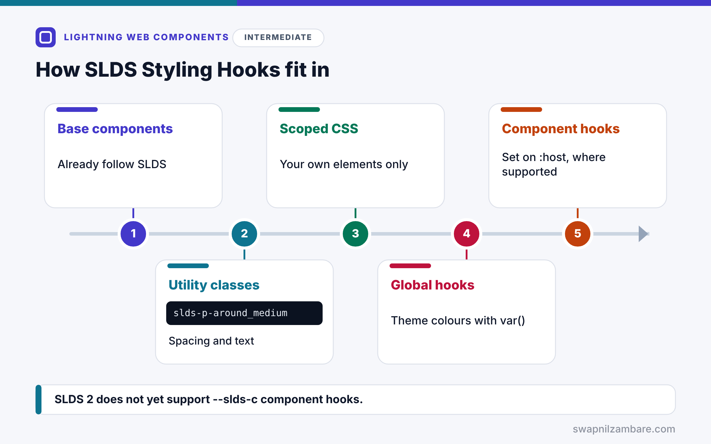
SLDS Styling Hooks fit into a simple styling order. First, use base components, which already follow SLDS. Next, add SLDS utility classes, such as slds-p-around_medium, for spacing and text. Then write component CSS for your own elements, which Shadow DOM keeps inside the component. After that, use global hooks with var() for colours, so your CSS follows the theme. Finally, where supported, set component hooks on :host to adjust base components.
SLDS Utility Classes
Utility classes handle common needs: slds-p-around_medium adds padding, slds-m-top_small adds margin, and slds-text-heading_small sets a heading size. Use them before writing custom CSS.
Scoped Component CSS
A component’s .css file only affects its own template. So a rule for .card in courseCard does not touch any other component.
The :host Selector
:host styles the component’s own outer element. It is also where you set component styling hooks for the base components inside.
Global Styling Hooks
Global hooks, such as –slds-g-color-success-container-1, are shared values. Read them with var(), and add a fallback value for safety.
Component Styling Hooks and SLDS 2
Component hooks, such as –slds-c-button-brand-color-background, adjust base components. However, SLDS 2 does not yet support component hooks, so Salesforce advises orgs that rely on them to stay on SLDS 1 themes for now.
Styling Options at a Glance
The table below sums up the styling tools in order of preference.
| Tool | Example | Use for |
|---|---|---|
| Base components | lightning-card | Standard UI pieces |
| Utility classes | slds-p-around_medium | Spacing and text |
| Scoped CSS | .card in courseCard.css | Your own elements |
| Global hooks | var(–slds-g-color-brand-base-50) | Theme colours |
| Component hooks | –slds-c-button-… on :host | Base component tweaks, SLDS 1 |
Styling Hooks vs CSS Overrides
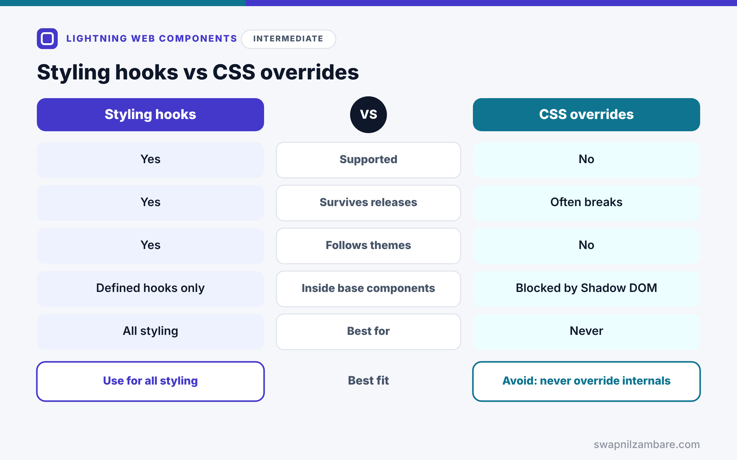
The table below compares supported hooks with overriding SLDS internals.
| Feature | SLDS Styling Hooks | CSS overrides of internals |
|---|---|---|
| Supported by Salesforce | Yes | No |
| Survives releases | Yes | Often breaks |
| Follows themes | Yes | No |
| Reaches inside base components | Through defined hooks only | Blocked by Shadow DOM |
| Best for | All styling | Never |
When to use which is simple. Use hooks, utility classes and your own scoped CSS. Never try to restyle the inside of base components with overrides.
A Real SLDS Styling Hooks Example
Let’s apply SLDS Styling Hooks to the course card at Bright Path Tutors. The card uses theme colours, and online courses get a success badge.
Step 1: The Template with Utility Classes
<template>
    <div class="course-card slds-p-around_medium slds-m-bottom_small">
        <p class="slds-text-heading_small">{course.Name}</p>
        <template lwc:if={course.Is_Online__c}>
            <span class="badge-online slds-m-top_x-small">Online</span>
        </template>
        <lightning-button label="Enrol" variant="brand" class="slds-m-top_small"></lightning-button>
    </div>
</template>
Utility classes add padding, margins and the heading size. Then the two custom classes, course-card and badge-online, get their look from the component CSS.
Step 2: The Component CSS with Global Hooks
:host {
    display: block;
}

.course-card {
    border-radius: 0.5rem;
    background: var(--slds-g-color-neutral-base-100, #ffffff);
    border-left: 4px solid var(--slds-g-color-brand-base-50, #0176d3);
}

.badge-online {
    display: inline-block;
    padding: 0.125rem 0.5rem;
    border-radius: 1rem;
    background: var(--slds-g-color-success-container-1, #acf3e4);
    color: var(--slds-g-color-on-success-1, #056764);
}
:host makes the component a block element. The card reads the neutral background and brand colour from global hooks, with fallbacks. The badge uses the success container and the matching on-success text colour, so contrast stays readable.
Step 3: A Component Hook for SLDS 1 Themes
:host {
    --slds-c-button-brand-color-background: var(--slds-g-color-brand-base-50, #0176d3);
    --slds-c-button-brand-color-border: var(--slds-g-color-brand-base-50, #0176d3);
}
This changes the brand button colour inside the component, the supported way. Use it only on SLDS 1 themes until SLDS 2 supports component hooks.
Step 4: See the Result
Here is what the card looks like for an online course.
| Apex Basics                 (blue left border)
| [Online]                    (green badge, dark green text)
| [Enrol]                     (brand button)
The card matches the org theme and needs no override of Salesforce internals.
SLDS Styling Hooks and Dark Mode
Global hooks have values for light and dark themes. So when you use hooks instead of fixed colours, your components are ready for theme changes, including dark mode where Salesforce supports it.
Common Mistakes with SLDS Styling Hooks
- Hard-coding colours instead of using global hooks.
- Trying to style the inside of base components with selectors.
- Relying on component hooks in an org that uses SLDS 2.
- Writing custom CSS for spacing that utility classes already cover.
- Forgetting fallback values in var().
Best Practices for SLDS Styling Hooks
- Use base components and utility classes first.
- Read colours from global hooks with fallbacks.
- Set component hooks on :host, only where supported.
- Keep component CSS small and scoped.
- Check the SLDS styling hook index before inventing new values.
Practice Task
Add a “Full” badge for courses with no seats left, using the error colours. Hint: look up an error container hook in the SLDS styling hook index, and add a fallback colour.
Most Asked Interview Questions on SLDS Styling Hooks
Styling questions often test whether you follow supported patterns. Here are the 21 questions asked most about SLDS Styling Hooks.
Basic Questions on SLDS Styling Hooks
Q1: What are styling hooks?
CSS custom properties that SLDS defines, so you can style components in a supported way.
Q2: What is the difference between –slds-g and –slds-c hooks?
–slds-g hooks are global values, while –slds-c hooks adjust specific base components.
Q3: How do you read a hook in CSS?
Use var(), such as var(–slds-g-color-brand-base-50, #0176d3).
Q4: Is component CSS global?
No, because Shadow DOM scopes it to the component.
Q5: What does :host do?
It styles the component’s own outer element.
Q6: What are SLDS utility classes?
Ready-made classes, such as slds-p-around_medium, for spacing, text and layout.
Q7: Does SLDS 2 support component styling hooks?
Not yet, so orgs that rely on them should stay on SLDS 1 themes for now.
Code and Scenario Questions on SLDS Styling Hooks
Q8: How do you change a base button’s colour?
Set its component hooks on :host, where component hooks are supported.
Q9: Why add a fallback in var()?
So the style still works if the hook is not defined.
Q10: Can you target elements inside lightning-button with CSS?
No, because Shadow DOM blocks it, and overrides are not supported.
Q11: How do you add padding without custom CSS?
Use an SLDS utility class, such as slds-p-around_medium.
Q12: How do you keep text readable on a coloured badge?
Pair a container hook with its matching on- colour hook.
Q13: Where do you set component hooks?
On :host or a container element in your component’s CSS.
Q14: How do you share styles between components?
Create a CSS-only module and import it into each component’s CSS.
Advanced Questions on SLDS Styling Hooks
Q15: Why do CSS overrides break after releases?
Because base component internals and SLDS classes can change at any time.
Q16: How do hooks help with themes?
Hooks change value with the theme, so components follow it automatically.
Q17: What is SLDS 2?
The newer version of the design system, with updated themes built on global styling hooks.
Q18: Can you override global hook values?
Salesforce does not support overriding global hook values in customizations.
Q19: How do you check hook names?
Use the styling hook index on the Lightning Design System site.
Q20: How does Shadow DOM affect global page CSS?
Page CSS cannot reach inside components, so each component styles itself.
Q21: What is the safest styling order?
Base components, then utility classes, then scoped CSS with global hooks.
Official Resources
Quick Recap
- SLDS Styling Hooks are supported CSS custom properties.
- Global hooks start with –slds-g, and component hooks start with –slds-c.
- Component CSS is scoped, and :host styles the component itself.
- SLDS 2 does not yet support component hooks.
- Never override base component internals.
What’s Next?
Components can live far beyond record pages. Next, read our guide to using LWC in flows, quick actions and Experience Cloud.