Lightning Base Components are the ready made building blocks Salesforce ships for Lightning Web Components. Instead of writing an input, its label, its error state and its styling by hand, you write one tag. So screens look native, behave correctly on mobile and stay accessible without extra work.
This post builds on LWC fundamentals and SLDS styling hooks. We will build a course form for Bright Path Tutors.
What are Lightning Base Components?
Lightning Base Components are components in the lightning namespace that you use inside your own templates. They cover inputs, buttons, cards, tables, layouts, tabs, modals and record forms. Salesforce builds and maintains them, so they follow the design system automatically.
Think of buying ready mixed concrete instead of mixing sand and cement yourself. The result is consistent, it arrives faster and someone else is responsible for the recipe.
Why Lightning Base Components Matter
Hand written HTML inside Salesforce looks wrong almost immediately. Fonts differ, spacing is off and the page fails accessibility checks.
Lightning Base Components solve that in one step. They also keep working through Salesforce releases, so your component picks up design changes without a rewrite.
How Lightning Base Components Work
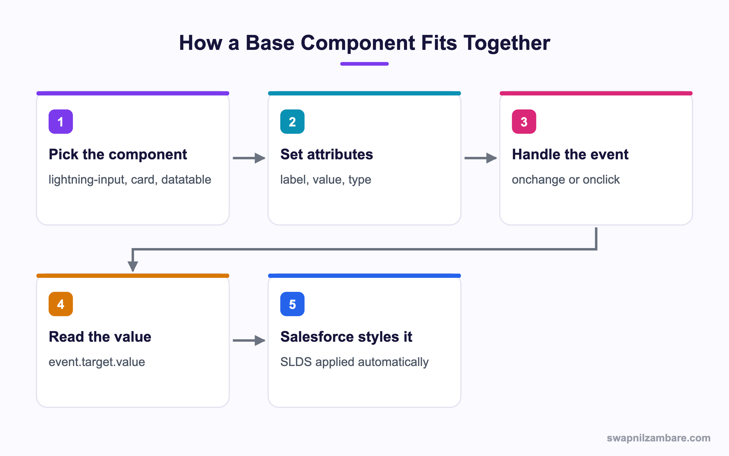
Lightning Base Components take attributes for configuration and fire events when the user acts.
A Simple Form
<template>
    <lightning-card title="New course" icon-name="standard:education">
        <div class="slds-var-m-around_medium">
            <lightning-input
                label="Course name"
                value={name}
                onchange={handleName}>
            </lightning-input>

            <lightning-input
                type="number"
                label="Fee"
                formatter="currency"
                value={fee}
                onchange={handleFee}>
            </lightning-input>

            <lightning-combobox
                label="Level"
                value={level}
                options={levelOptions}
                onchange={handleLevel}>
            </lightning-combobox>
        </div>
        <div slot="footer">
            <lightning-button variant="brand" label="Save" onclick={handleSave}>
            </lightning-button>
        </div>
    </lightning-card>
</template>
The slot="footer" attribute places the button in the card’s footer region. Slots are how base components let you insert your own markup.
Reading the Values
import { LightningElement } from 'lwc';

export default class CourseForm extends LightningElement {
    name = '';
    fee = 0;
    level = 'Beginner';

    levelOptions = [
        { label: 'Beginner', value: 'Beginner' },
        { label: 'Intermediate', value: 'Intermediate' },
        { label: 'Advanced', value: 'Advanced' }
    ];

    handleName(event) { this.name = event.target.value; }
    handleFee(event) { this.fee = event.target.value; }
    handleLevel(event) { this.level = event.detail.value; }
}
Notice the difference. lightning-input gives you event.target.value, while lightning-combobox uses event.detail.value. That inconsistency catches people out, so check the documentation per component.
Validating Input
Base components handle validation for you if you ask them to.
handleSave() {
    const inputs = [...this.template.querySelectorAll('lightning-input')];
    const allValid = inputs.reduce((valid, input) => {
        input.reportValidity();
        return valid && input.checkValidity();
    }, true);

    if (!allValid) { return; }
    // proceed with save
}
Adding required or min to the input is enough for the component to show its own error message.
Common Lightning Base Components
This table lists the ones you will use most.
| Component | Purpose |
|---|---|
| lightning-card | A titled container with header and footer slots |
| lightning-input | Text, number, date, checkbox and more |
| lightning-combobox | A picklist style dropdown |
| lightning-button | A styled button with variants |
| lightning-datatable | A sortable, selectable table |
| lightning-layout | A responsive row and column grid |
| lightning-tabset | Tabbed sections |
| lightning-spinner | A loading indicator |
| lightning-record-form | A whole record form with no markup |
Layout Without CSS
<lightning-layout multiple-rows="true">
    <lightning-layout-item size="12" medium-device-size="6" padding="around-small">
        <lightning-input label="First name"></lightning-input>
    </lightning-layout-item>
    <lightning-layout-item size="12" medium-device-size="6" padding="around-small">
        <lightning-input label="Last name"></lightning-input>
    </lightning-layout-item>
</lightning-layout>
The fields stack on a phone and sit side by side on a laptop, with no media queries written by you.
Base Components vs Custom HTML
This table shows what you give up by hand coding.
| Feature | Base components | Custom HTML |
|---|---|---|
| Salesforce styling | Automatic | Manual |
| Accessibility | Built in | Your responsibility |
| Mobile behaviour | Responsive | You handle it |
| Release updates | Maintained | You maintain |
| Flexibility | Bounded | Total |
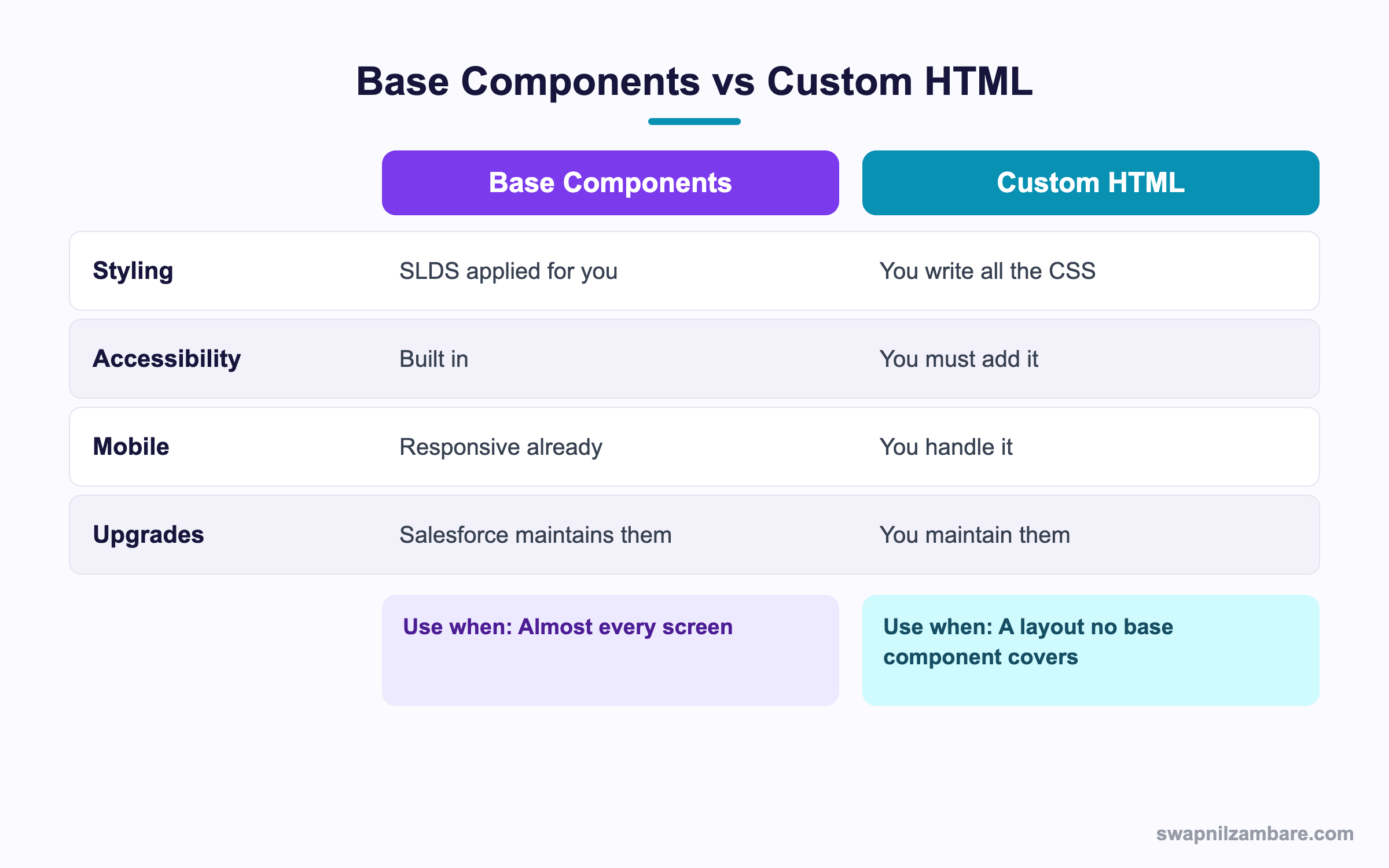
In short, start with a base component. Drop to raw HTML only when none fits what you need.
A Real Lightning Base Components Example
Bright Path wants a course search panel with a text box, a dropdown filter, a results table and a loading spinner.
Step 1: The Template
<template>
    <lightning-card title="Find a course">
        <div class="slds-var-m-around_medium">
            <lightning-layout multiple-rows="true">
                <lightning-layout-item size="12" medium-device-size="8" padding="around-x-small">
                    <lightning-input label="Search" type="search" onchange={handleSearch}>
                    </lightning-input>
                </lightning-layout-item>
                <lightning-layout-item size="12" medium-device-size="4" padding="around-x-small">
                    <lightning-combobox label="Level" options={levels} onchange={handleLevel}>
                    </lightning-combobox>
                </lightning-layout-item>
            </lightning-layout>

            <template lwc:if={loading}>
                <lightning-spinner alternative-text="Loading"></lightning-spinner>
            </template>

            <template lwc:if={rows}>
                <lightning-datatable
                    key-field="Id"
                    data={rows}
                    columns={columns}
                    hide-checkbox-column
                    onrowaction={handleRowAction}>
                </lightning-datatable>
            </template>
        </div>
    </lightning-card>
</template>
Step 2: The Columns
const COLUMNS = [
    { label: 'Course', fieldName: 'Name' },
    { label: 'Fee', fieldName: 'Fee__c', type: 'currency' },
    { label: 'Level', fieldName: 'Level__c' },
    {
        type: 'action',
        typeAttributes: { rowActions: [{ label: 'View', name: 'view' }] }
    }
];
A row action column gives each row its own menu without extra markup.
Step 3: Handle the Action
handleRowAction(event) {
    const row = event.detail.row;
    if (event.detail.action.name === 'view') {
        this.dispatchEvent(new CustomEvent('courseselected', { detail: row.Id }));
    }
}
These are the attributes we used and what each does.
| Attribute | Effect |
|---|---|
| key-field | Names the unique field per row |
| hide-checkbox-column | Removes row selection |
| type currency | Formats the number with a currency symbol |
| alternative-text | Screen reader text for the spinner |
| variant brand | Makes the button the primary colour |
Common Mistakes with Lightning Base Components
- Reading event.target.value when the component sends event.detail.value.
- Styling a base component from outside, which shadow DOM blocks.
- Rebuilding an input by hand instead of using the base one.
- Forgetting key-field on a datatable, which breaks row tracking.
- Leaving out alternative-text, which fails accessibility checks.
Styling Lightning Base Components Correctly
Because base components use shadow DOM, your CSS cannot reach inside. Instead, use SLDS utility classes on the wrapper, or the styling hooks each component exposes. A hook is a CSS custom property with a documented name, so Salesforce promises it will keep working. Setting one on a parent element changes the look without reaching into private markup.
.my-wrapper {
    --slds-c-card-color-background: #f7f7fb;
}
Best Practices for Lightning Base Components
- Reach for a base component before writing HTML.
- Check whether the value arrives on target or detail for each one.
- Use lightning-layout rather than custom grid CSS.
- Add required and min attributes so validation is handled for you.
- Keep datatables small and page the data for large result sets.
Practice Task
Build a component with a card, two inputs and a save button in the footer slot. Show a spinner while a flag is true. Hint: use slot equals footer on the button wrapper.
Most Asked Lightning Base Components Interview Questions
These Lightning Base Components questions appear in nearly every LWC interview.
Basic Lightning Base Components Interview Questions
Q1: What are Lightning Base Components?
Lightning Base Components are prebuilt components in the lightning namespace that handle styling, accessibility and behaviour for you.
Q2: Name five common ones.
The Lightning Base Components you meet first are lightning-card, lightning-input, lightning-button, lightning-datatable and lightning-layout.
Q3: How do you read a value from lightning-input?
Read it from event.target.value inside the change handler.
Q4: How do you read a value from lightning-combobox?
Read it from event.detail.value, which differs from lightning-input and trips people up.
Q5: What is a slot?
It is a named placeholder where you insert your own markup, such as the footer of a card.
Q6: Which component shows a loading indicator?
lightning-spinner, with an alternative-text attribute for screen readers.
Q7: What does key-field do on a datatable?
It names the unique field for each row, which the component uses to track rows.
Q8: Which component renders a whole record form?
lightning-record-form, which handles layout, save and field access automatically.
Intermediate Lightning Base Components Interview Questions
Q9: Why can you not style a base component with your own CSS?
Because shadow DOM encapsulates its internals. So use SLDS classes outside it or the styling hooks it exposes.
Q10: What are styling hooks?
CSS custom properties a component exposes, letting you change colours and spacing in a supported way.
Q11: How do you validate inputs before saving?
Query the inputs, call reportValidity on each and combine the checkValidity results.
Q12: What is the difference between lightning-record-form and lightning-record-edit-form?
Record-form is the fastest with almost no markup. Record-edit-form gives you control over each field and the layout.
Q13: How do you make a layout responsive?
Use lightning-layout-item with size and medium-device-size, which handles the breakpoints for you.
Q14: What variants does lightning-button support?
Common ones are neutral, brand, destructive and success, which set the colour and emphasis.
Q15: How do you add actions to datatable rows?
Add a column of type action with rowActions, then handle the onrowaction event.
Q16: Can base components be used in Experience Cloud?
Yes, and they pick up the site branding automatically.
Advanced Lightning Base Components Interview Questions
Q17: Scenario: a datatable with 5,000 rows freezes the page. What do you do?
Page the data in Apex, load a few hundred rows at a time and use the onloadmore event for infinite loading.
Q18: How do you build a custom datatable column type?
Extend LightningDatatable in a child component and register a custom type with its own template.
Q19: Why avoid querying inside the shadow DOM of a base component?
Because its internal structure is private and changes between releases, so your selector will break.
Q20: Scenario: a design calls for a layout no base component provides. What do you do?
Build it with SLDS grid classes in your own markup, while still using base components for the controls inside.
Q21: How do base components affect performance?
They add some weight, but they are optimised and cached. Badly structured data and too many wire calls cost far more.
Q22: How do you keep forms accessible?
Always set a label, use alternative-text on non-text elements and let the component manage focus and error announcements.
Q23: What happens when Salesforce updates a base component?
Your component picks up the change automatically, which is why relying on its internal DOM is risky.
Q24: When would lightning-record-form be the wrong choice?
When you need custom validation, conditional fields or a layout that does not match the page layout.
Q25: Do Lightning Base Components work offline?
Some do in the mobile app with offline support, but data still needs caching. So test the real flow on a device before promising it.
Q26: Are Lightning Base Components available in Aura too?
Yes, many have Aura equivalents. However, new work should use the LWC versions.
Q27: How do you find the right component quickly?
Search the Component Library, which lists every attribute, event and example. Then copy the example and adapt it.
Q28: Scenario: a base component looks wrong inside a custom page. Why?
Usually a parent CSS rule or a missing SLDS wrapper class. So check the surrounding markup before blaming the component.
Q29: Should you ever rebuild a base component yourself?
Only when none fits and the design is fixed. Because you then own accessibility, mobile and upgrades forever.
Official Resources
- Lightning Web Components Component Reference
- Lightning Design System
- Trailhead: Lightning Web Components Basics
Quick Recap
- Lightning Base Components give you styling and accessibility for free.
- Attributes configure them and events report user actions.
- Some send values on target, others on detail.
- Shadow DOM blocks outside CSS, so use styling hooks.
- Use lightning-layout instead of writing your own grid.
What’s Next?
Next, we build record forms fast with lightning-record-form and record-edit-form.